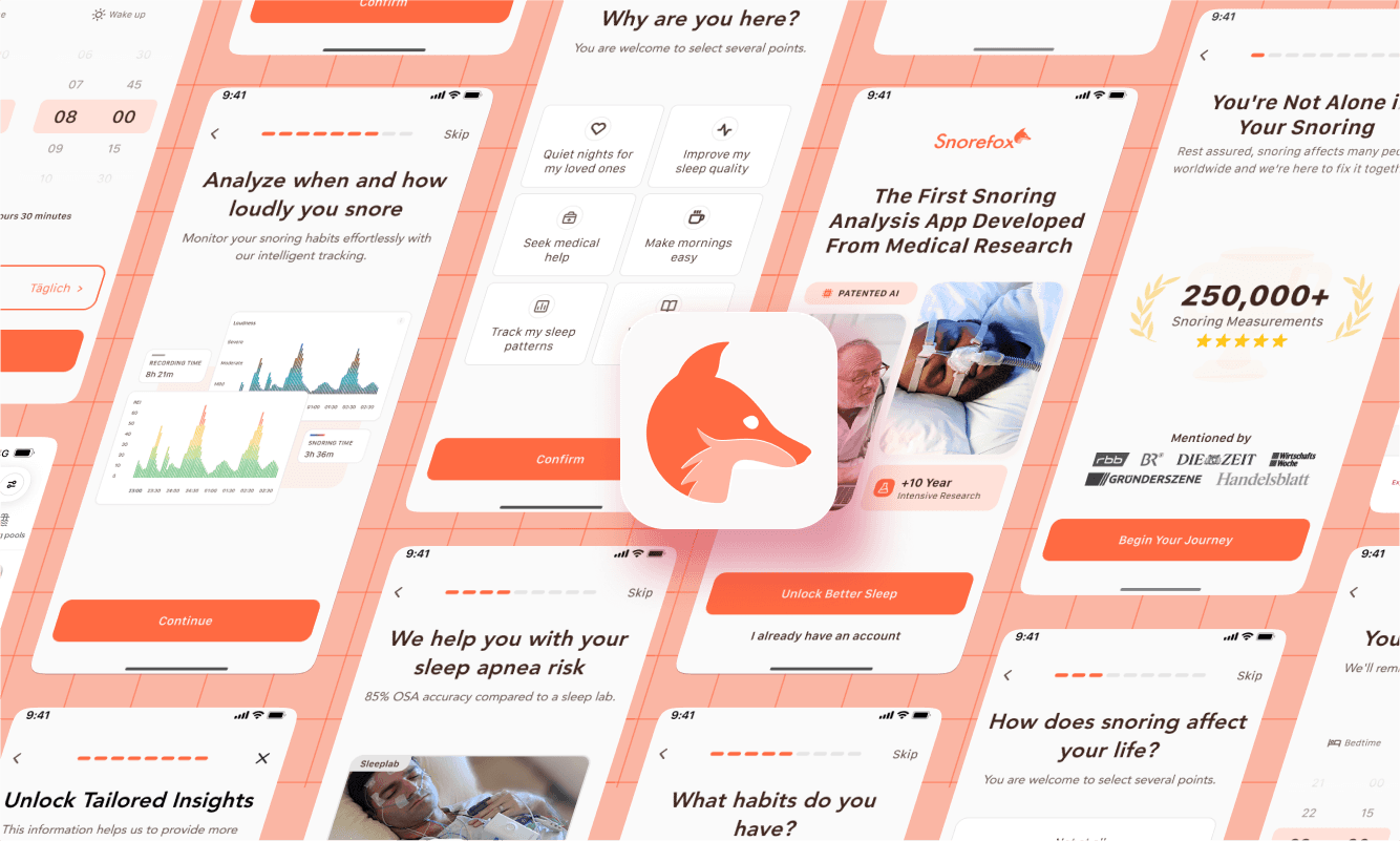
Snorefox is a mobile app that helps users detect signs of sleep apnea by analyzing their snoring through overnight audio recordings. A key feature of the app is its medically certified analysis, available through a paid upgrade. This redesign project aimed to create a clearer, more intuitive, and higher-converting upgrade experience. Snorefox is developed by Diametos GmbH, a German health tech startup specializing in digital diagnostics for sleep disorders.
+59.2% Conversion Rate
My Role
Team
Timeline
2 Months
Company
Diametos GmbH
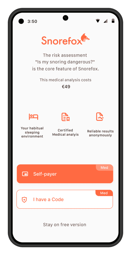
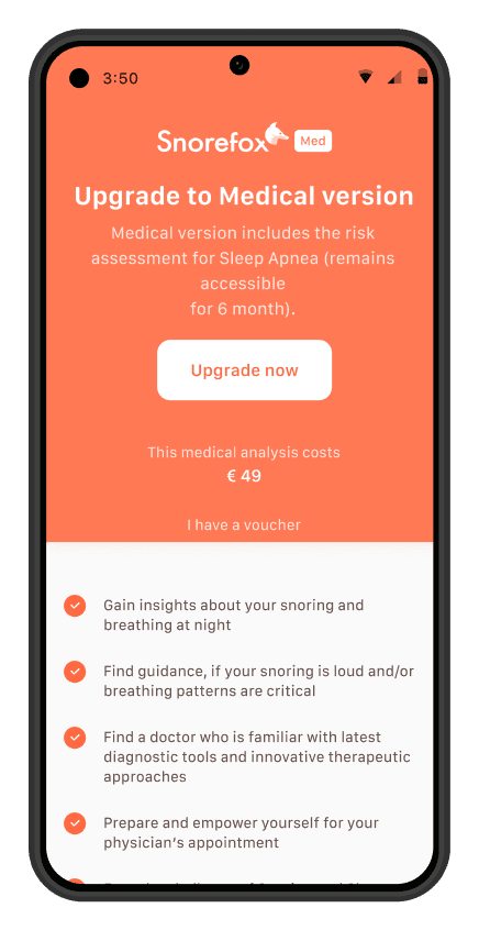
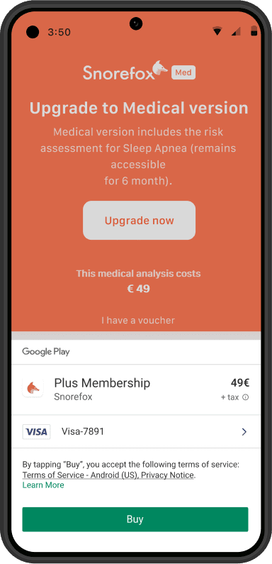
A cluttered, outdated screen was costing us revenue
The upgrade screen was one of the most important conversion points but it was falling short. With a conversion rate of just 3.97%, it was clear that something in the experience was creating hesitation and drop-off. And for an app that relied on upgrades to survive, we couldn’t afford to ignore it any longer.
The Old Upgrade Flow
Visually cluttered
Split across two screens
Outdated design
How I researched what was blocking users from upgrading
I reviewed analytics, conducted user interviews, and explored how competitors presented their upgrade offers. I was hoping that this research would help me uncover confusion around the offer’s value and identify friction points that were causing users to drop off.
User Interviews
12 Participants
Analytics Review

Firebase

Google Analytics

Microsoft Clarity
Competitor Analysis

SnoreLab

BetterSleep

Shuteye

Sleep Monitor

Sleep Cycle
The user interview questions were based on Nielson's 10 Usability Heuristic:
Did you understand what you would get after upgrading?
Did anything feel confusing or unexpected?
Did the design help you focus on what was important?
Was there enough information to make a confident decision?
Did the screen make you feel confident about upgrading?
The insights that guided my design decisions
Listening to users and analyzing behavior through analytics helped me find the critical pain points that need to be addressed:
Insight 1: Users were confused about the value
"I don't know what am getting, I cannot understand what the app does nor what the premium version adds"
Opportunity
Clarify the offering with detailed explanations, visual previews, and benefit-oriented language.
Insight 2: Users found the screen cluttered and overwhelming
"The screen is inconsistent which makes me sceptical and I am not having enough trust"
Opportunity
Redesign the interface with a clean visual hierarchy, focused content, and consistent spacing.
Insight 3: The two-page upgrade flow created friction
"I expected the payment process to start when I clicked the first time"
Opportunity
Streamline the flow into a single, well-structured screen to reduce decision fatigue and increase conversion.
A full redesign wasn't an options so I had to work within the constraints
Since a full redesign wasn’t an option, I had to work carefully within the existing design system. To explore ideas, I started with simple pen-and-paper wireframes before moving to digital versions.
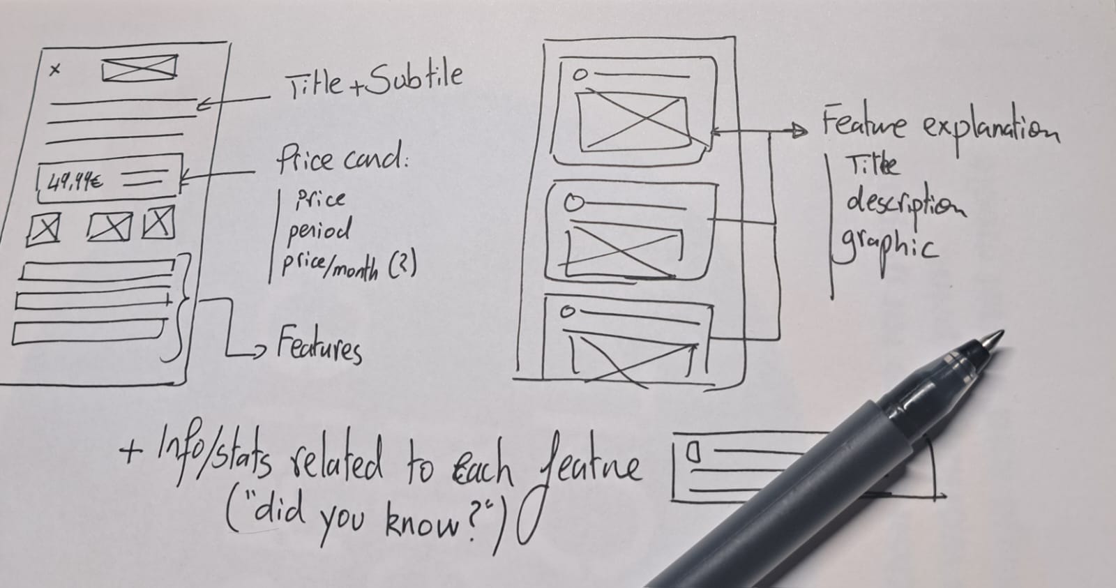
Design Iterations
It took a few tries, but I got there in the end
I didn’t land on the solution right away. But with each iteration, I got closer to building something that actually worked for people, not just in design, but in tone, timing, and clarity.
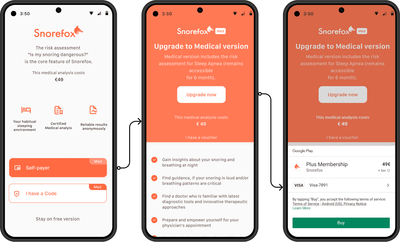
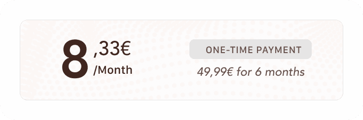
Price card design
Instead of showing the full price upfront (€49.99 for 6 months), I emphasized the monthly equivalent (€8.33/month). This framing lowers the perceived cost and makes the upgrade feel more approachable and easier to justify. To address user concerns about the app being “too expensive” or potentially deceptive, I clearly labeled this as a one-time payment. This reassures users that there are no hidden or recurring charges, reinforcing trust and transparency. Dark Patterns are always worth fighting!
Single Amount, No Framing

Value-Focused Pricing Breakdown
Unique selling propositions
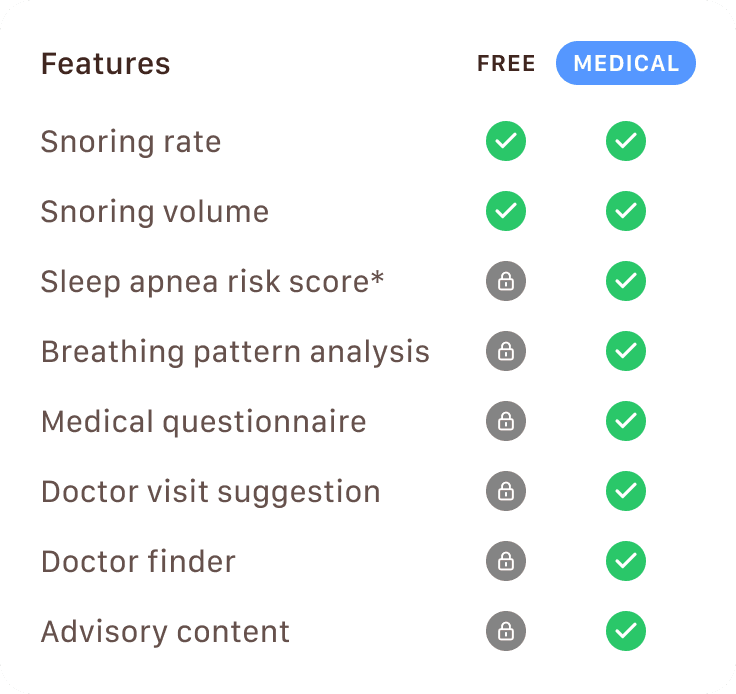
From a psychological perspective, users are more likely to convert when they feel informed and in control of their decision. A side-by-side comparison works better than highlighting only the medical features since it taps into cognitive ease and reduces the mental effort required to evaluate the options. It also leverages the contrast effect by making the premium tier's added value feel more substantial when directly compared to the free version. This format also addresses a key user concern: ambiguity. By clearly outlining what is included in each version, the table builds trust, reduces hesitation, and lowers the perceived risk.
Medical-Only Features
Side-by-Side Comparison
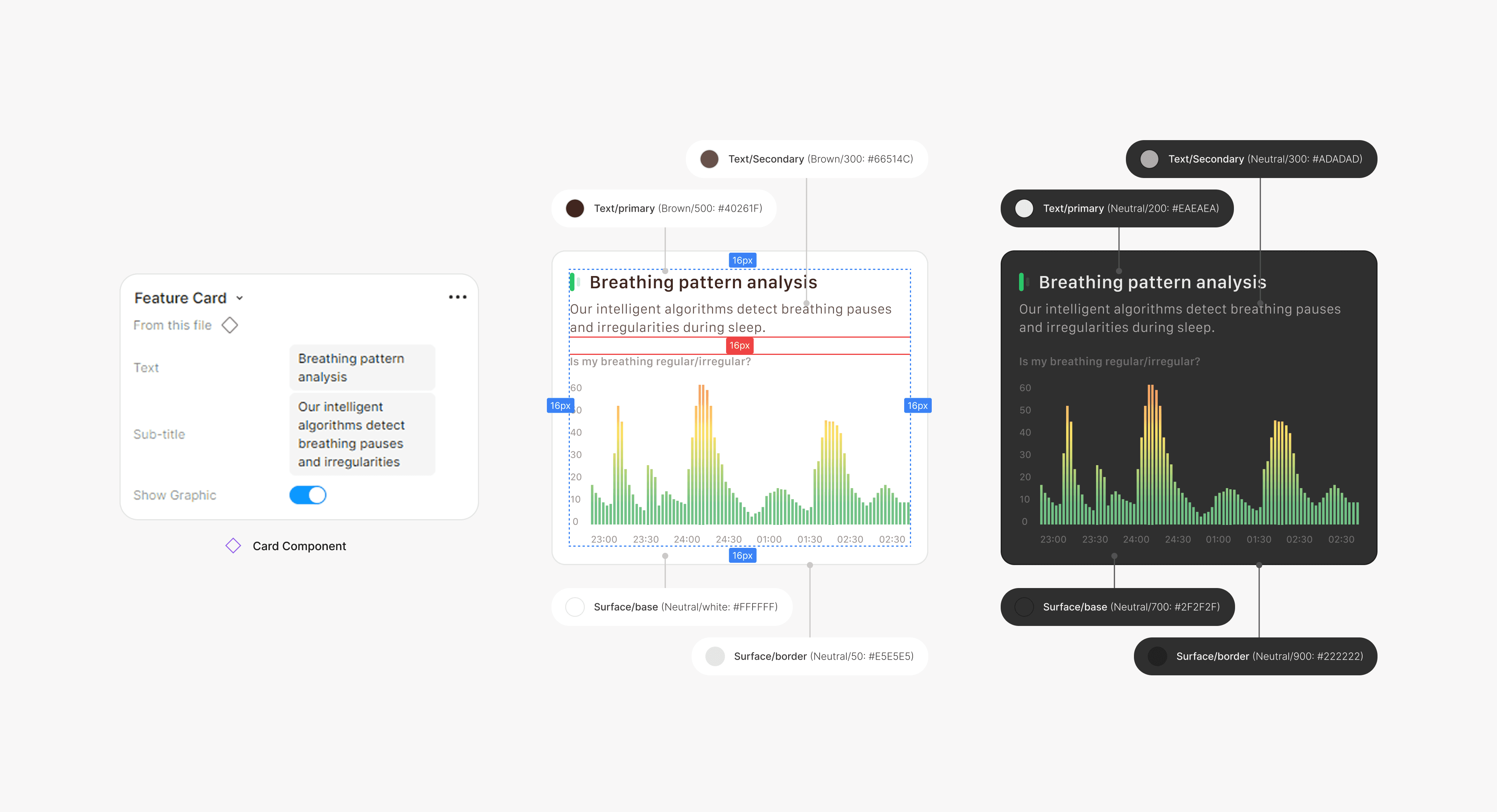
Designing the perfect feature card
The feature card was very important in communicating the premium benefits with clarity and ease. It was designed to improve scannability, reduce cognitive load, and maintain consistency across different devices.
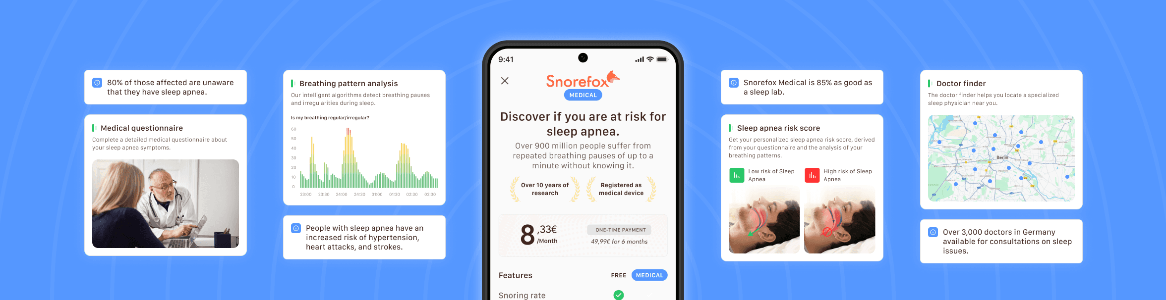
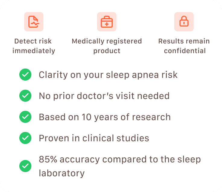
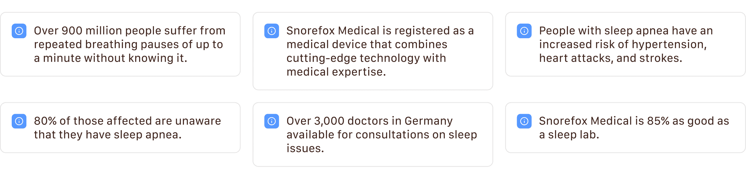
Building awareness with key facts
I incorporated general statistics about sleep apnea alongside data on the app’s effectiveness to give users a fuller picture of the problem and the solution. These facts complement the feature cards by providing context and credibility.
Educational Information
Results
A clear win for conversions!
The re-designed upgrade screen brings everything together into a smooth, cohesive experience that feels clear and intentional. By simplifying the flow, clarifying the value, and building user trust, the redesign led to a 59.2% increase in conversion rate, rising from 3.97% to 6.32%.