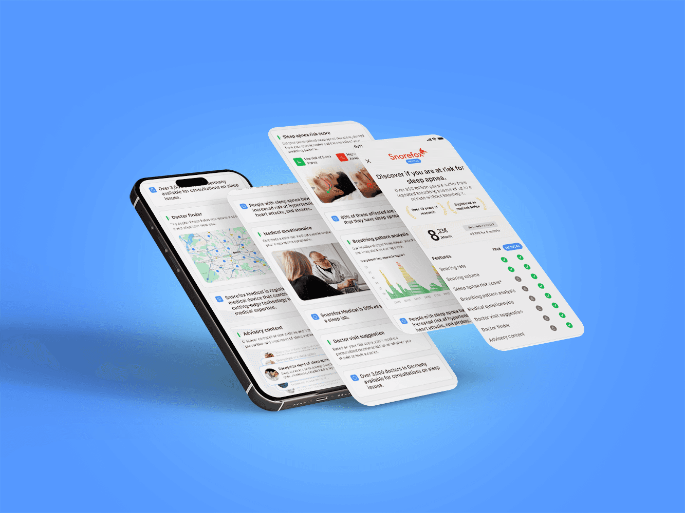
Sleep Number ($SNBR) is a leading innovator in sleep technology, best known for its smart beds and wellness ecosystem. As part of its expansion into digital health, Sleep Number launched BreatheIQ, a new mobile app aimed at helping users track and understand their nighttime breathing. I joined the project at its inception and was responsible for defining the visual language, designing the first product screens, and building the design system from the ground up.
+200K Downloads
My Role
Founding Product
Designer
Team
Timeline
12 Months
Company
Sleep Number
Corporation
Sleep Number needed to move beyond the smart mattresses into digital health
Sleep Number had built a strong presence in the smart sleep market, with connected mattresses and a companion app that allowed users to control and personalize their bed settings. But beyond the bed itself, there was a clear gap, they didn't have no digital tools to help users understand their sleep more holistically.
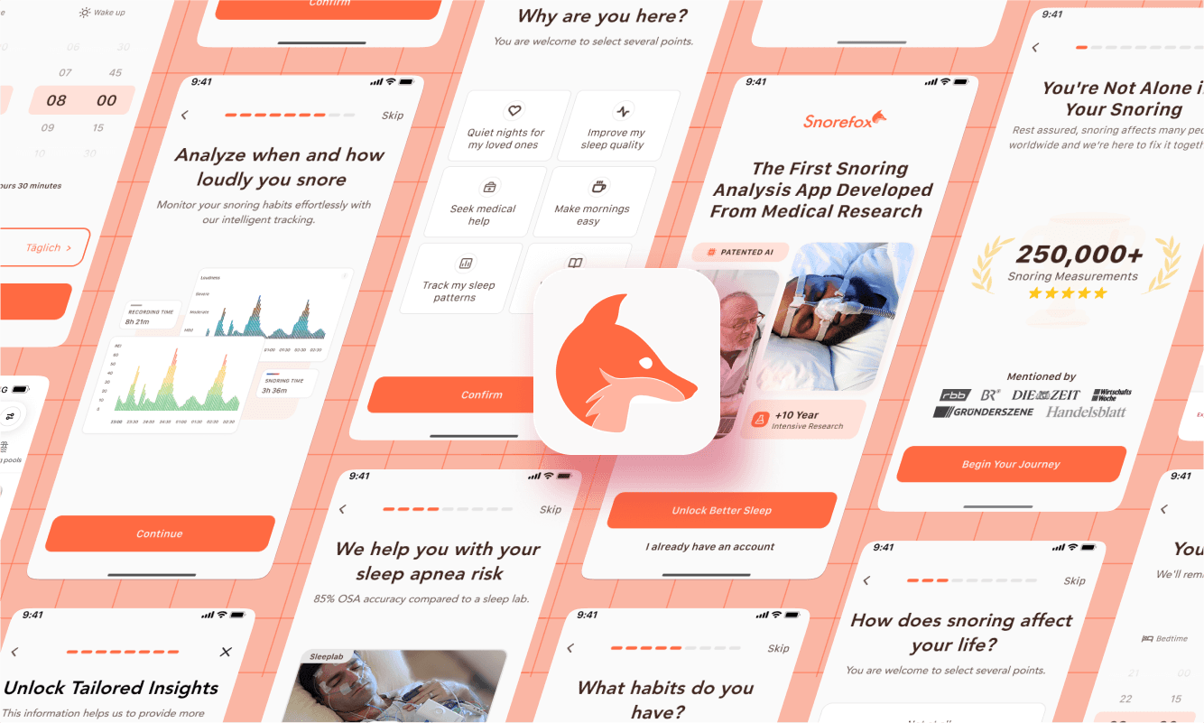
As the company began shifting toward health-focused digital services, they saw an opportunity to fill that gap. That idea became BreatheIQ: a new app focused on nighttime breathing and snoring. But with no existing product, interface, or design system, I took the lead in translating the vision into a real product by building the design system and creating the first set of screens from the ground up.

A professional foundation I could build on
Before design work began, the broader team collaborated with C Space, a market research agency, to conduct foundational research that would shape the direction of BreatheIQ. The goal was to understand user attitudes, behaviors, and unmet needs related to nighttime breathing and snoring. While I was not directly involved in this phase, this research defined the direction for the product strategy and design approach that I followed.
Research Method
21 Moderated
In-Depth Interviews
conducted by:

The user needs that defined the initial release
The research showed that users had several unmet needs when it came to understanding and managing their nighttime breathing. Specifically, they were looking for a solution that could do:
Snoring Detection
Identify and track snoring patterns in a way that was clear, consistent, and easy to understand.
Educational Content
Provide informational material to help users understand the causes and implications of snoring and nighttime breathing issues.
Trust & Credibility
Establish credibility, ensuring the app felt trustworthy and grounded in science or expert guidance.
Shared Sleep Support
Enable use without sleeping alone, offering ways to record or gather insights even when sharing a bed.
Health Integration
Connect with health providers, either by facilitating data sharing or aligning with medical advice.
Ecosystem Integration
Integrate seamlessly into the existing Sleep Number ecosystem, enhancing the experience without redundancy or added friction.
How we initially translated user needs
Having a clear grasp of user needs, Product Management and I collaborated to map out the core user flow by defining how someone would engage with BreatheIQ from start to finish.
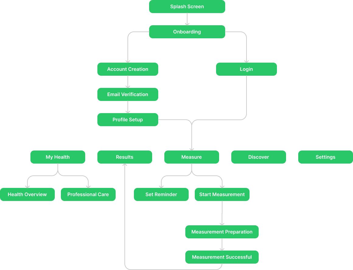
How I built the design system from scratch and made it work
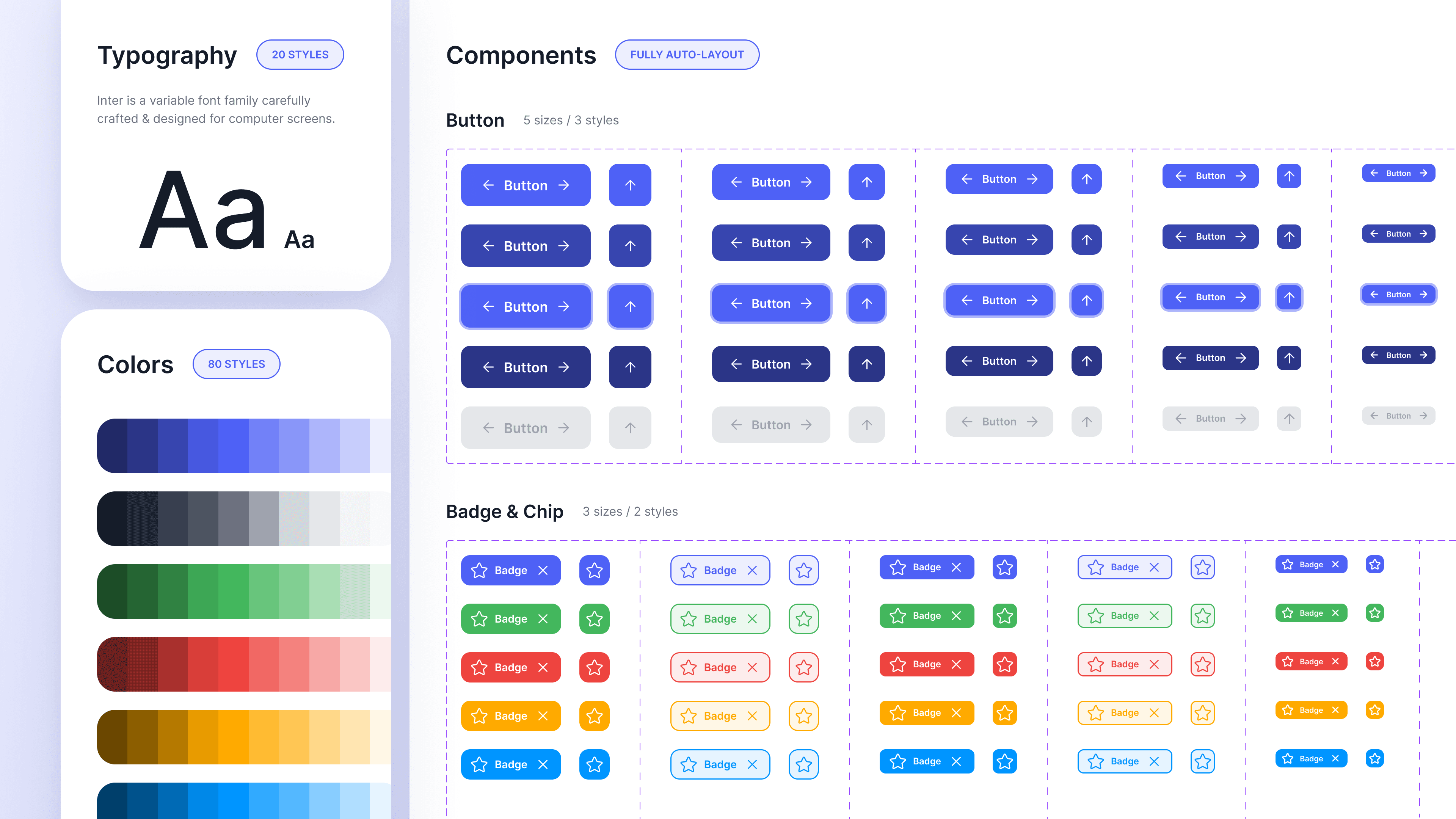
I built the design system from scratch to create a clear, consistent, and easy-to-use foundation. This helped the team design and develop faster while keeping everything scalable and cohesive.
Color Palette
I started by defining a base set of color tokens in Figma—these are the foundational values for the entire system (shown below). From there, I created semantic color variables that map those tokens to specific roles in the interface, such as text, surfaces, backgrounds, and components like cards or buttons. This structure allowed for clearer design decisions and made it much easier to scale or adjust themes later, since updates could be made at the token level without breaking consistency across the UI.
Primary Color
AAA
50
#E5EBED
AAA
100
#CCD6DE
AAA
200
#99ABBD
AAA
300
#597287
AAA
400
#335978
AAA
500
#003057
Accent Color
AAA
100
#CFFAFF
AAA
300
#B5FAFF
AAA
500
#85F5FF
Status Colors
AAA
100
#FFE8A0
AAA
300
#FFDC70
AAA
500
#FFC511
AAA
100
#C4FEDE
AAA
300
#A6FDCD
AAA
500
#6BFCAC
AAA
100
#FCB7A6
AAA
300
#FB9379
AAA
500
#F84B20
Typography
For the typography, I established a clear type scale in Figma that balanced readability with brand expression. I defined text styles for headings, body text, captions, and labels—each with consistent spacing, weight, and hierarchy. These styles were set up as reusable variables to ensure consistency across screens and streamline collaboration with developers.
Aa
Avenir
Heavy
Roman
Light
Title
Body
Body/18, Heavy
Body/18, Roman
Body/16, Heavy
Body/16, Roman
Body/16, Light
Info
Body/14, Heavy
Body/14, Roman
Body/14, Light
Body/12, Heavy
Body/12, Roman
Spacing
I implemented an 8pt spacing system to ensure visual consistency and a clean, structured layout across the app. Spacing variables in Figma were defined and reused throughout components, making it easier to scale the design and maintain alignment across different screen sizes and use cases.
Main Container
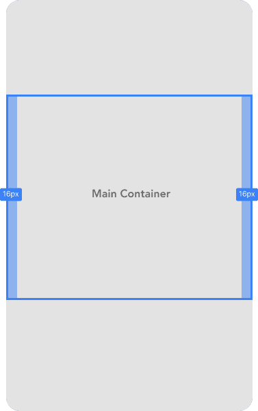
Side padding is 16px.
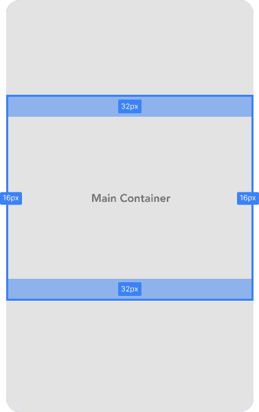
Top and bottom padding is 32px.
Section Spacing
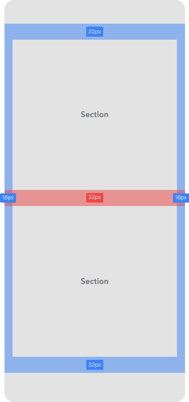
For normal sections, spacing is 32px.
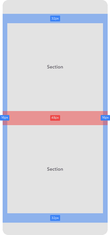
For large sections, spacing is 48px.
Card Spacing
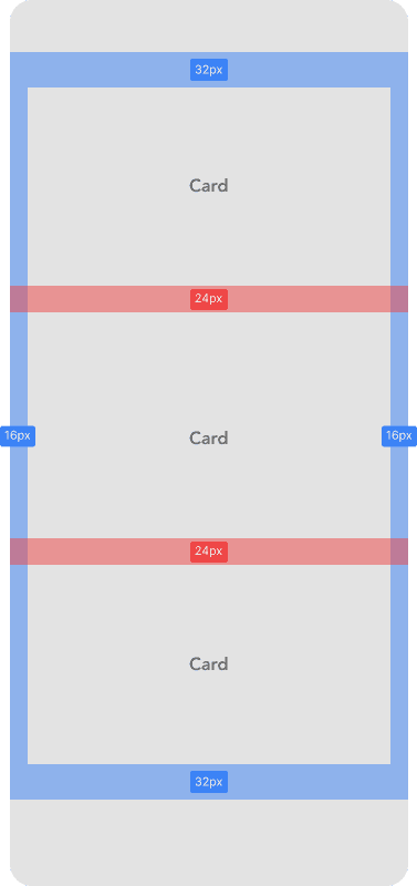
Card spacing is 24px.
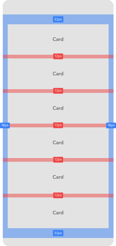
Stacked card spacing is 12px.
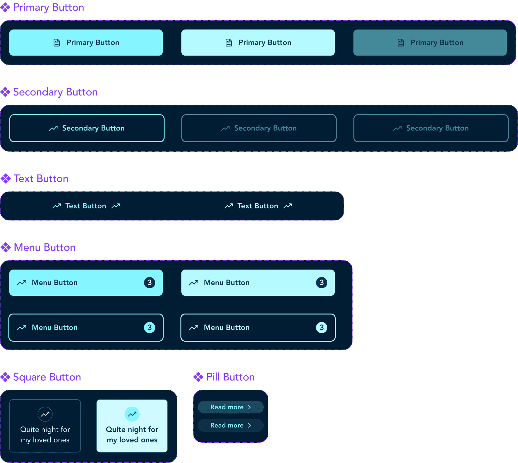
Buttons
The button system was designed to be highly flexible and modular, with multiple styles for different use cases. Each button variant supports the addition of icons, labels, loading indicators, and various interaction states (hover, focus, disabled) while maintaining visual consistency across the app.
Inputs
I designed a flexible input system to support a wide range of use cases, from simple text fields to more complex forms like date selection and personal information entry. Inputs were built in multiple styles to match different contexts such as onboarding, health data, or profile updates.
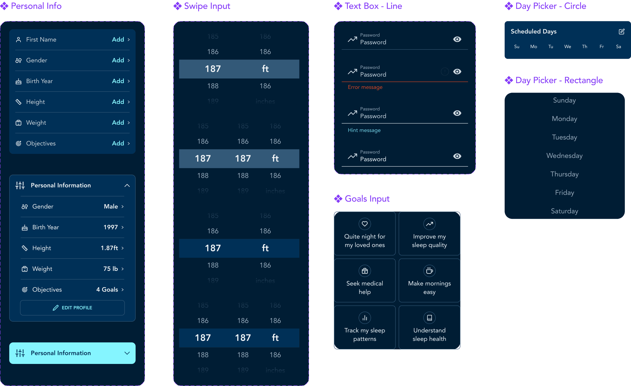
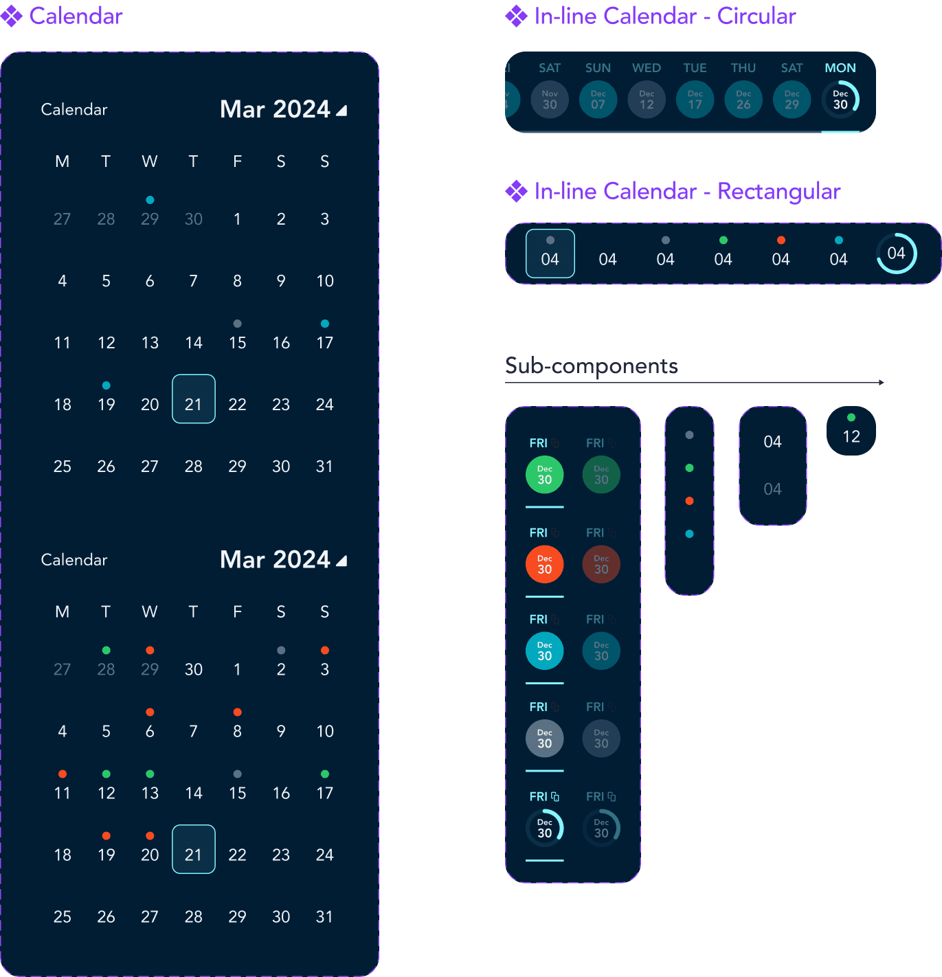
Calendar
The calendar was one of the most component-heavy parts of the UI, so I built it using a fully atomic approach. A master component housed smaller, modular pieces (days, weeks, labels, and states) which allowed for maximum flexibility. This structure gave the team complete freedom when creating new variants or adjusting functionality, without breaking the overall consistency of the calendar experience.
And more!
Beyond the previously mentioned elements, I developed a comprehensive library of design system components covering key areas such as cards, navigation, headers, results, animations, and more. Each element followed the same principles of scalability, clarity, and semantic consistency
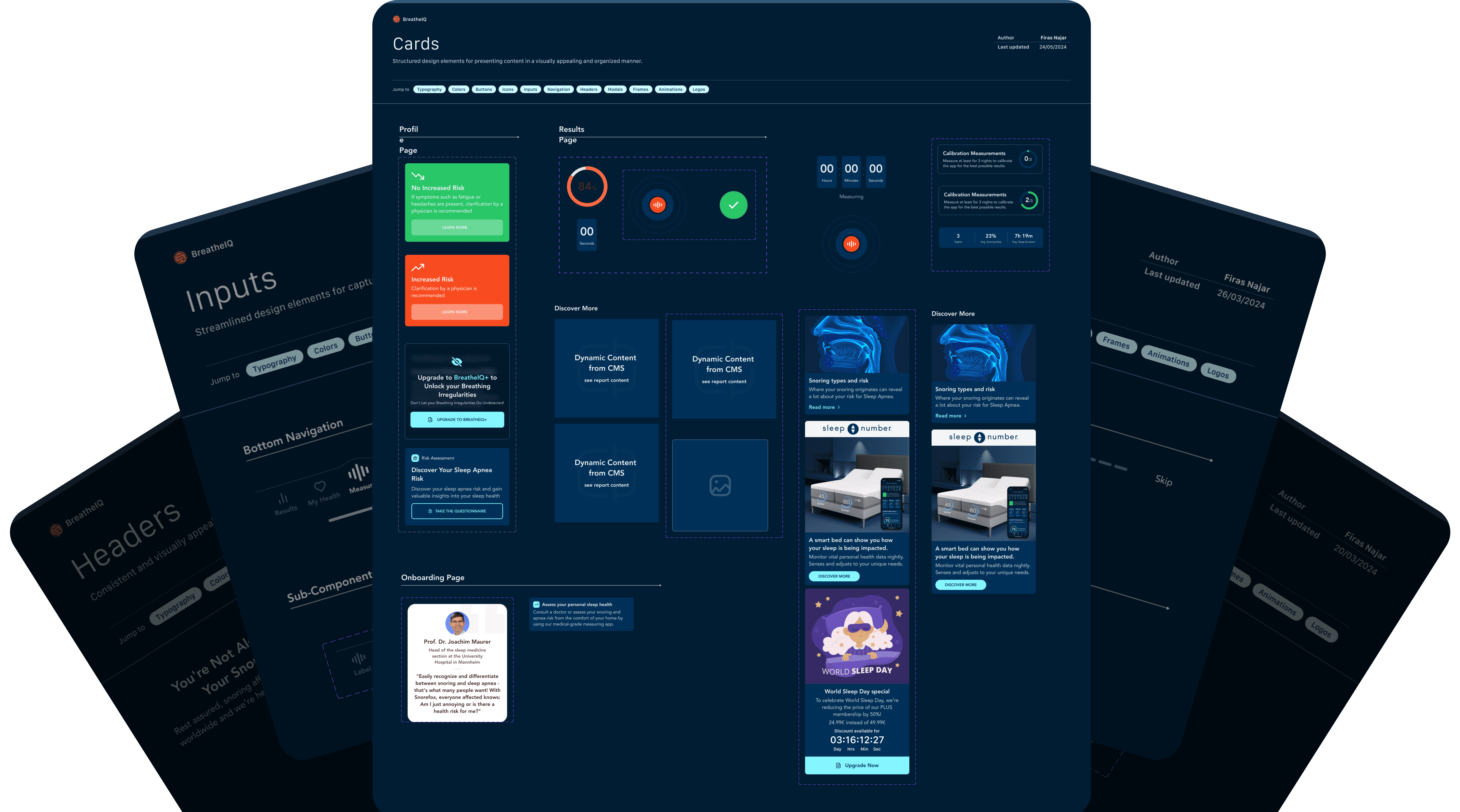
Results
After a year of struggles and setbacks, the app comes to life!
After a year filled with challenges and setbacks, the app finally came to life. Despite the hurdles, it resonated with users and has been downloaded over 200,000 times, representing a major step forward in helping people better understand and manage their nighttime breathing.