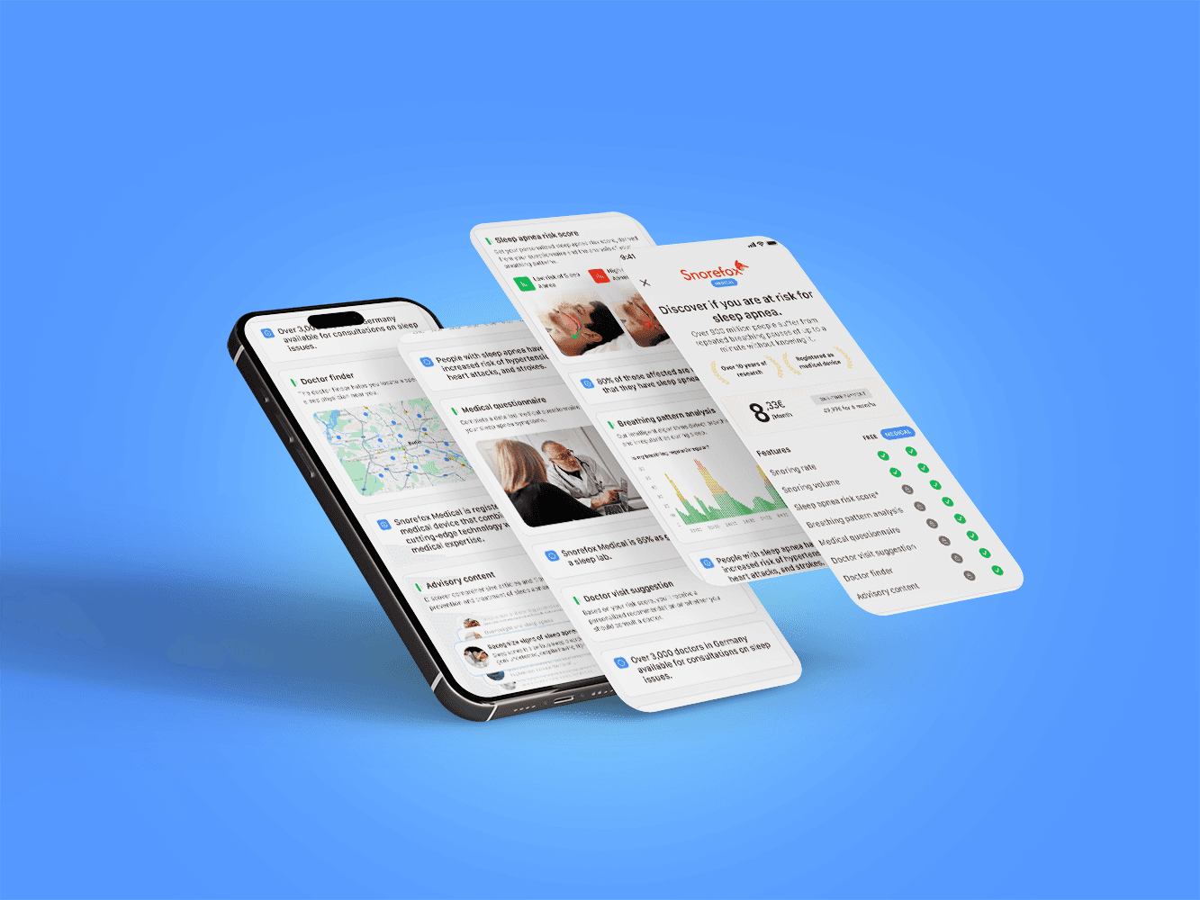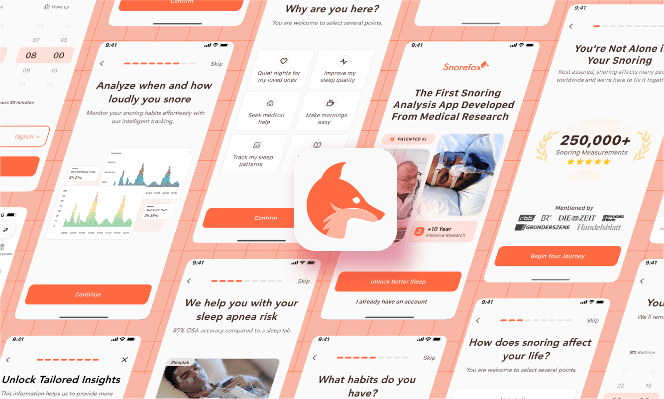
Snorefox is a mobile app focused on helping users detect signs of sleep apnea by analyzing snoring through overnight audio recordings. In this project, my goal was to explore ways to make the onboarding flow more interactive and engaging.
92% Positive Feedback
My Role
Team
Timeline
3 Months
Company
Diametos GmbH
Users came looking for help, but the app didn't greet them like it cared
When I joined Diametos, I noticed the onboarding flow hadn’t been touched in a long time. It wasn’t on the roadmap, and no one was planning to address it. Still, I saw an opportunity.
The Old Onboarding Flow
Unclear app value
Lacked trust signals
Outdated and static design
No one asked, but I started anyway
I flagged the onboarding issues to management, but was told there were no resources to address it. I pushed back, and they agreed to let me take it on independently, alongside my regular responsibilities.
The research was there but I had to see for myself
Although some internal marketing material existed, I was new to the company and wanted to dig in myself to truly understand snoring. I explored online sleep apnea communities, mapped out the user journey from first symptom to app usage, and interviewed people in my circle who snore.
User Interviews
9 Participants
Community Listening

r/Snoring

CPAP Forum
Competitor Analysis
VOS: Mental Health

Schlaftracker
Sleep Cycle
Fastic
It turned out snoring was deeper and more personal than I thought
As I dug into the research, I began to see snoring not just as a sleep issue, but as something deeply tied to shame, fear, and relationships. People weren’t just looking for data from an app, they wanted reassurance, clarity, and to feel taken seriously.
User voices
I gathered quotes from real conversations and online communities to understand how people who snore actually feel socially, emotionally, and medically. This kept the work grounded in real experiences and not just assumptions.

Dr. Craig L. Schwimmer
Otolaryngologist
“Snoring was ruining my marriage”
“This had a major impact on my wife's sleep patterns and I would often be reduced to sleeping in the guest bedroom”
“My snoring is making me anxious to sleep”
“My initial motivation was to stop my snoring so we could sleep in the same room”
“My hubs was not thrilled and I'm mortified. I usually have a thick skin and can just deal but all I want to do is cry”
“I've never felt so insecure about anything as i feel about my snoring....”
Pain points and needs
I identified key pain points from the research, then worked backwards to define the underlying needs. These insights directly shaped the tone and structure of the new onboarding.
Pain Point
Need
Supporting Environment
Users want thoughtful communication and a sense of shared experience to feel understood and less alone.
Pain Point
They feel uncertain and skeptical without a trustworthy and expert-backed guidance.
Need
Professional Guidance
Establish trust and authority through clear and credible information to reassure users and build confidence in the app.
Pain Point
They want to be guided by qualified healthcare professionals.
Need
Educational Content
Clear, expert-backed content that guides users forward.
Pain Point
They feel ashamed of their snoring and want to keep it confidential.
Need
Privacy and Discretion
Ensuring that personal data remain confidential and secure to protect user privacy.
Now that I knew what hurt, I could start designing for it
With real user struggles in mind, I began exploring ways to address them through design, not just functionally, but also emotionally.
Translating needs into visual language
I listed out each user need and treated it like a design challenge. For every insight, I brainstormed a couple visual or UX solutions.
Need
Supporting Environment
These design ideas aim to create a comforting, inclusive atmosphere by using gentle language and visuals that highlight shared experience. This reduces isolation, builds trust, and encourages users to engage confidently with their sleep health.
Communicate that snoring is a common issue.
Reinforce the message visually with a globe illustration.
Strengthen the sense of community by displaying how many measurements have already been recorded within the app.
Need
Professional Guidance
To convey a sense of professional credibility and guidance, the design reinforces the scientific and clinical foundation of the product. This helps users feel reassured that the insights they receive are not only accurate but also backed by expertise.
Highlight years of research behind the product to build authority.
Add the “AI-powered” label to communicate the advanced technology behind the app.
Present comparisons and statistics against sleep lab standards.
Need
Educational Content
To foster trust and keep users engaged, the design offers credible, digestible content tailored to each user’s experience. This helps users stay informed without feeling overwhelmed.
Provide personalized insights based on user data
Deliver bite-sized educational content to maintain interest
Need
Privacy and Discretion
To support user trust and safeguard personal concerns, the design prioritizes transparency and control. This ensures users feel safe, respected, and in charge of their own data.
Explain the purpose behind each data request clearly
Offer an easy, visible way to opt out of data donation
Iterations
Each version brought me closer to what users needed
I didn’t land the solution right away. But with each iteration, I got closer to building something that actually worked for people, not just in design, but in tone, timing, and clarity.
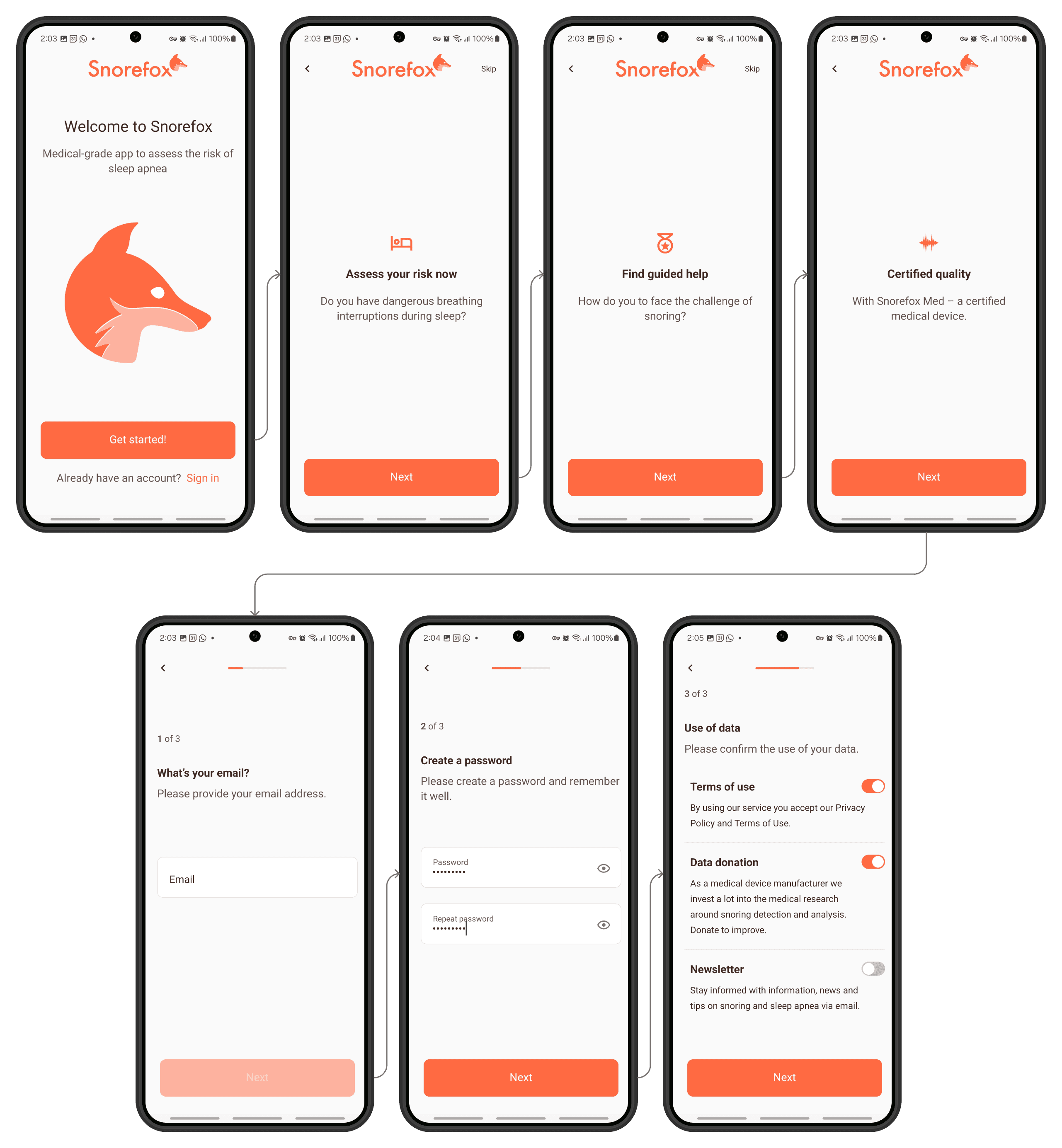
Iteration 1: Earning trust, then delivering value
I prioritized building trust early through social proof and medical authority followed by the app’s features.
After that, users moved into an interactive flow where every input gave them an immediate insight, creating a sense of progress and value early on.
23% Positive Feedback
User Flow
Static pages
Interactive pages
01
Welcome Screen
Conditioning the users that healing takes time
02
Social Proof
Invoking a sense of collectivism and community
03
Authority
Includes testimonials of different doctors
04
Feature 1
Sleep apnea risk assessement
05
Feature 2
Sleep tracking feature
06
Feature 3
Professional content
07
Goals Input
Serves as an indirect reminder of pain points
08
Insight
Personalized insights based on the goals selected
09
Sleep Routine Input
Doubles as the measurement reminder notification
10
Insight
Personalized insights based on the sleep routine
11
Demographic Input
Necessary for proper measurements
12
Insight
Personalized insights based on the demographic information
Iteration 2: Saving the insights for the end
This version opened the same way with static screens focuse on trust and positioning but I delayed the gratification to make the flow shorter.
Instead of giving insights one by one, I saved them and presented everything together at the end, simulating a more complete, diagnostic-like experience.
46% Positive Feedback
User Flow
01
Welcome Screen
Conditioning the users that healing takes time
02
Social Proof
Invoking a sense of collectivism and community
03
Authority
Includes testimonials of different doctors
04
Feature 1
Sleep apnea risk assessement
05
Feature 2
Sleep tracking feature
06
Feature 3
Professional content
07
Goals Input
Serves as an indirect reminder of pain points
08
Sleep Routine Input
Doubles as the measurement reminder notification
09
Demographic Input
Necessary for proper measurements
10
Loading screen
Highlights the personalized aspect of the insights
11
Personalized Report
Presents personalized insights based on the user inputs
Statis pages
Interactive pages
Iteration 3: Simulating a doctor's visit
This version took a more guided, narrative approach — simulating the flow of a medical consultation. I framed each question and screen to feel like part of a conversation with a professional, which helped create a sense of legitimacy and care.
I included the app feature screens between the input steps, making each one feel relevant to what the user had just shared.
92% Positive Feedback
User Flow
01
Welcome Screen
Conditioning the users that healing takes time
02
Social Proof
Invoking a sense of collectivism and community
03
Symptoms Input
Simulates the questions a doctor would ask
04
Intensity of Snoring Input
Simulates the questions a doctor would ask
05
Feature 1
Sleep apnea risk assessement
06
Lifestyle Habits Input
Simulates the questions a doctor would ask
07
Goals Input
Serves as an indirect reminder of pain points
08
Feature 2
Sleep tracking feature
09
Sleep Routine Input
Doubles as the measurement reminder notification
10
Demographic Input
Necessary for proper measurements
10
Loading screen
Highlights the personalized aspect of the insights
11
Personalized Report
Presents personalized insights based on the user inputs
Statis pages
Interactive pages
Results
Not shipped yet, but it got me rolling!
The final prototype hasn’t been implemented yet, but it’s on the roadmap. For me, this project wasn’t just about the output, it was the perfect way to dive into the product, understand the users, and start contributing meaningfully from day one. It laid the groundwork for what’s next and gave me momentum right from the start.